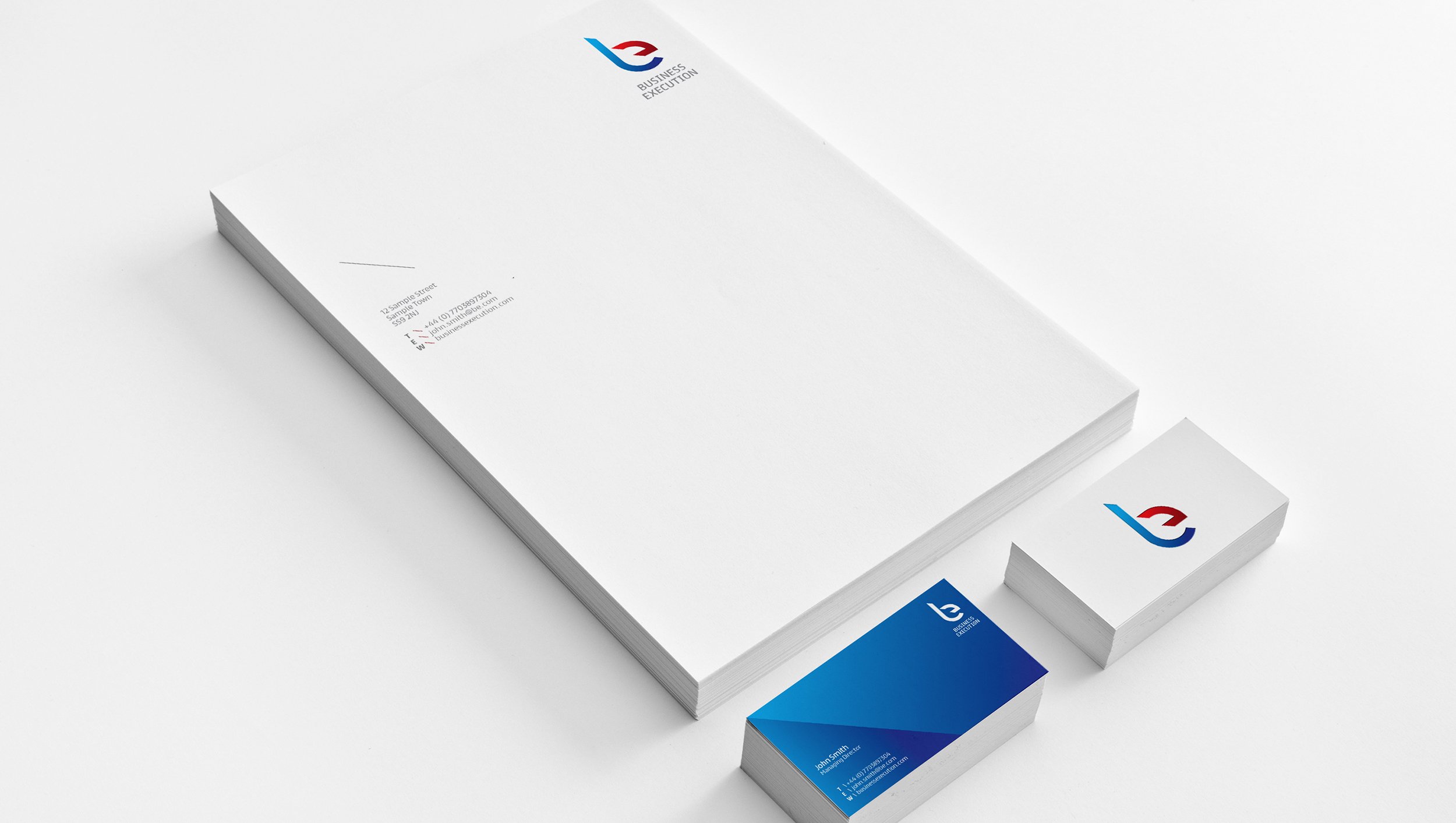
Business Execution
Project
Brand Identity
Involvement
Design Lead
Created at:
Founded
Business Execution transforms strategically failing companies and aligns them internally to put them back on track to where they need to be.
With the use of the B and E from the company name I created a bold, iconic brand mark with the letters ‘cut’ apart. The idea demonstrates how the company cut through clutter to achieve harmonious results. The colours represent a cold, results driven personality that, at the same time also tries to achieve a warm, emotional relationship with their clients.