Sons of Rathmoor
Project
Brand Identity
Involvement
Design Lead
Created at:
Studio ACT
Sons of Rathmoor is the brainchild of an Englishman and an Irishman (hold the joke!) both living in New York City. Their dream is to be the most highly regarded producer of English beef and pork produce in New York City.
Starting with cooked sausages from a van at local markets, eventually supplying high-end supermarkets. Using a well known British icon I created a brand identity that has a quintessentially British feel, whilst retaining a fun, artisan element.
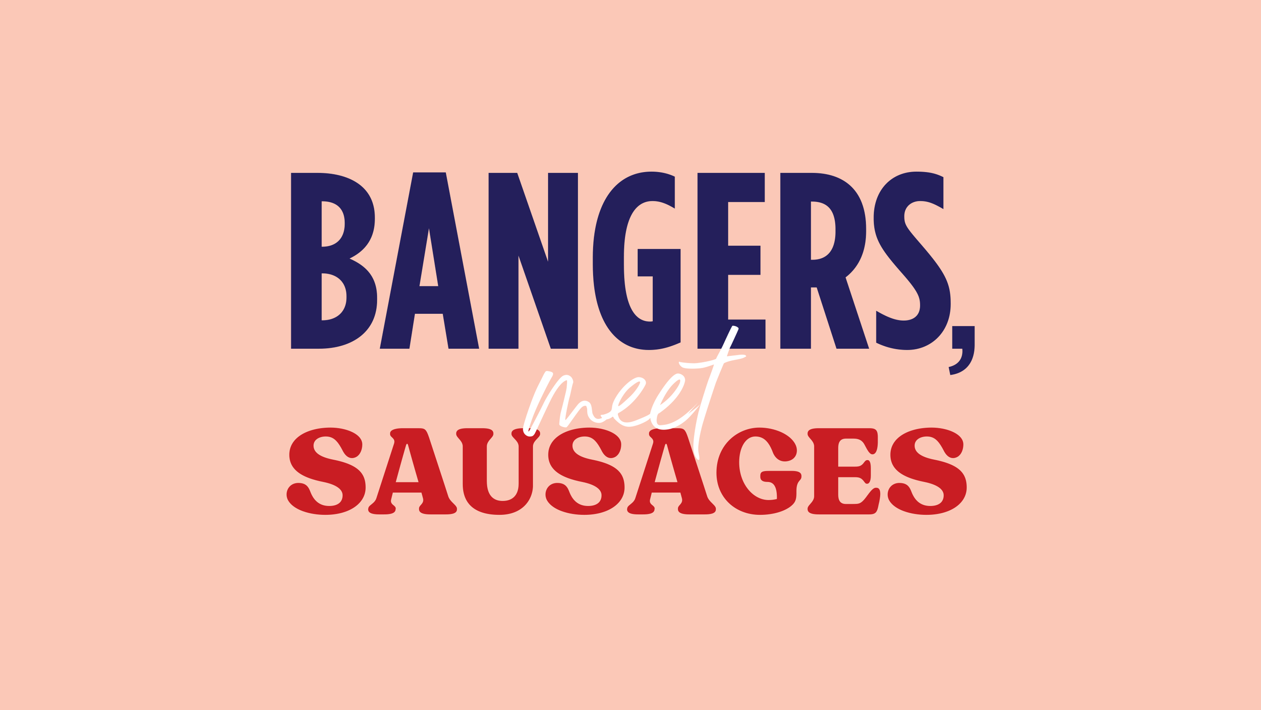
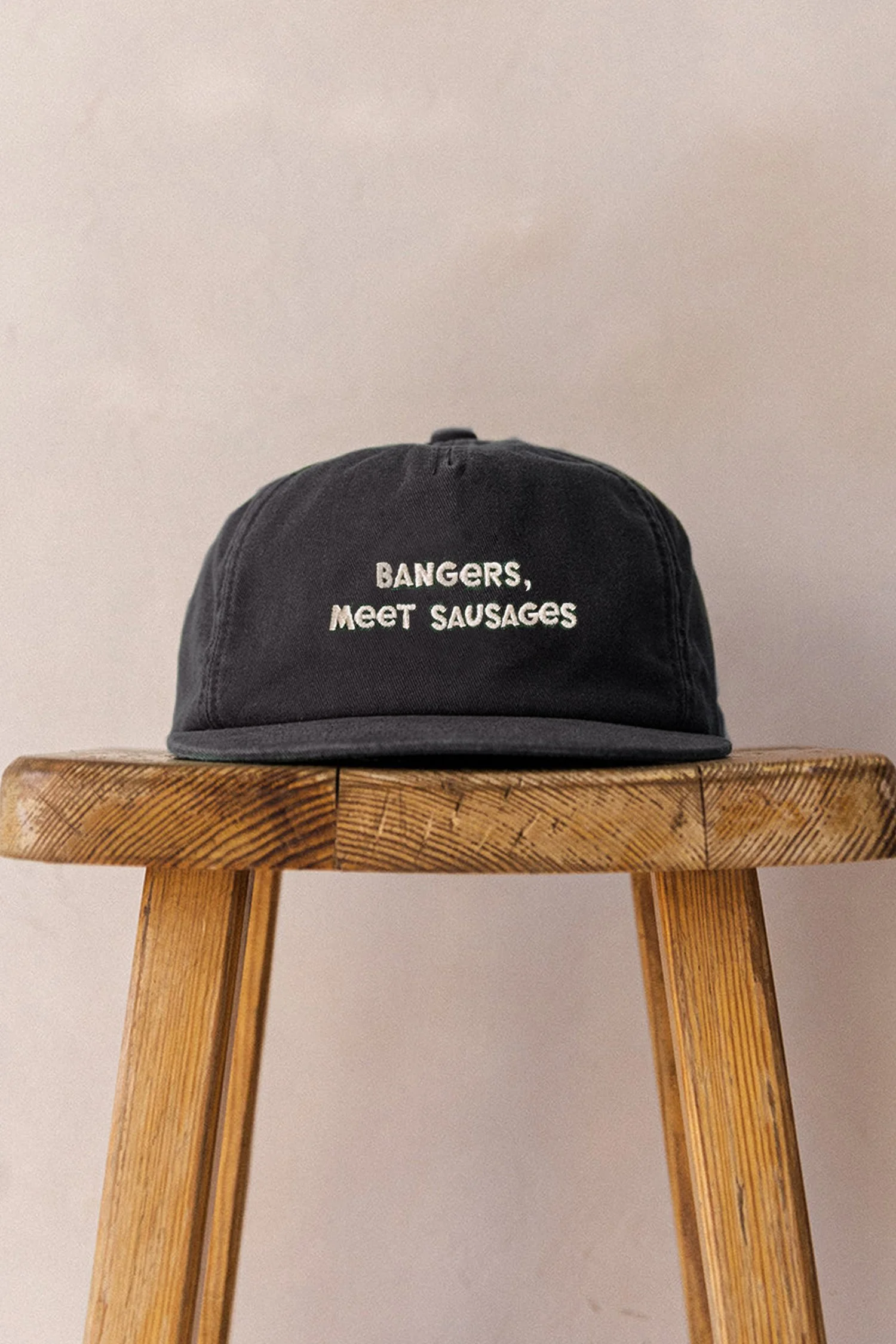
A playful tone of voice focuses on how the English language differs in the UK compared to across the pond. This is backed up by a colour palette that uses the similar red, white and blue of the Union Jack and the Stars and Stripes.