Sovereign Housing Association
Project
Brand Refresh, Guidelines & Annual Report
Involvement
Design Lead
Guidelines Designer
Artworker
Created at:
October Sun • London
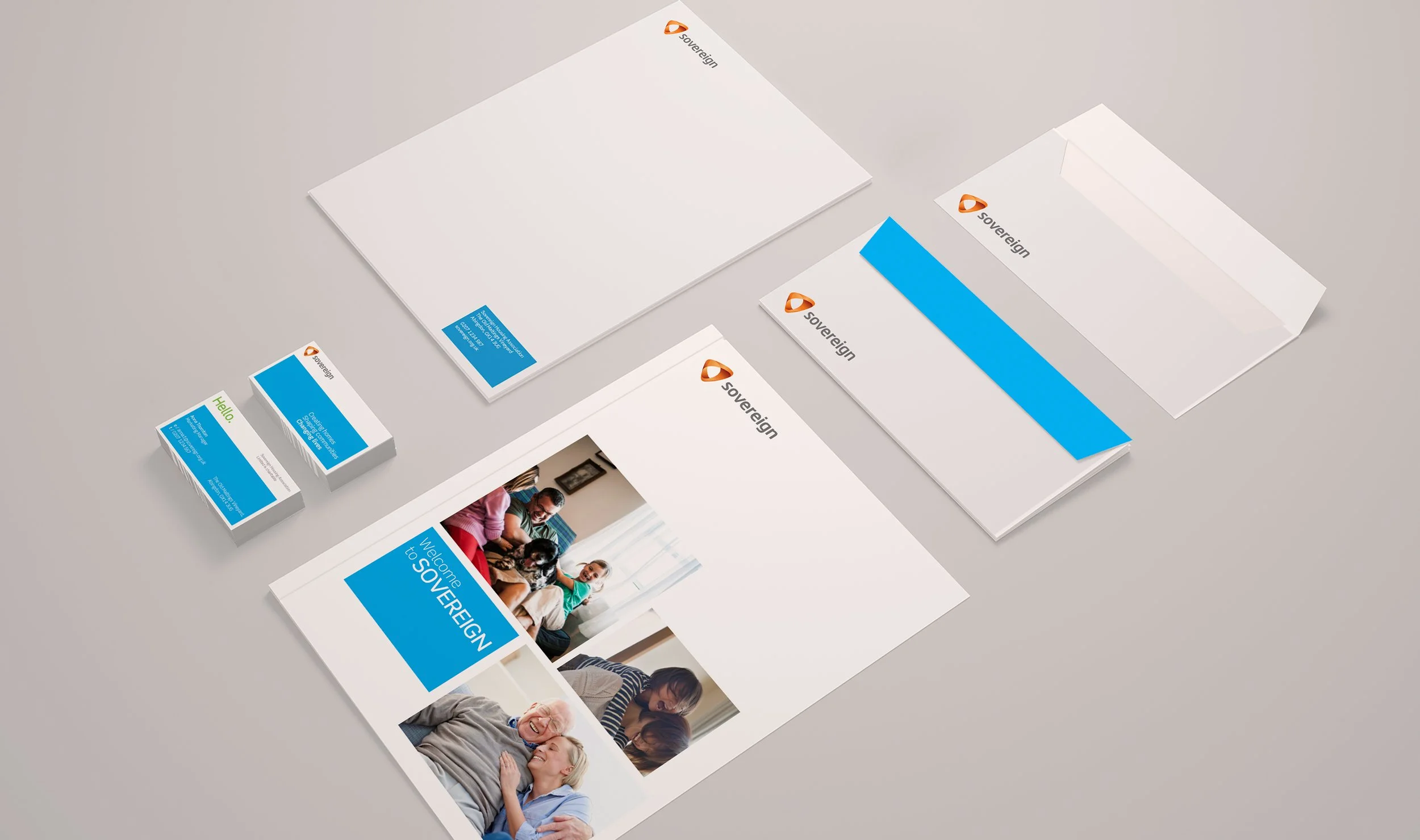
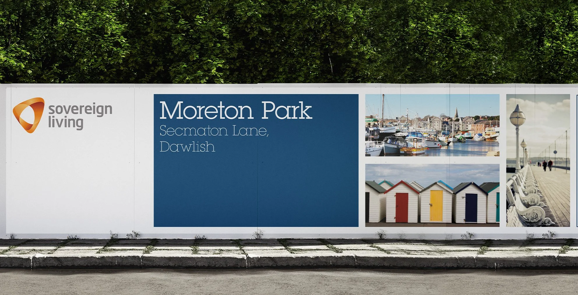
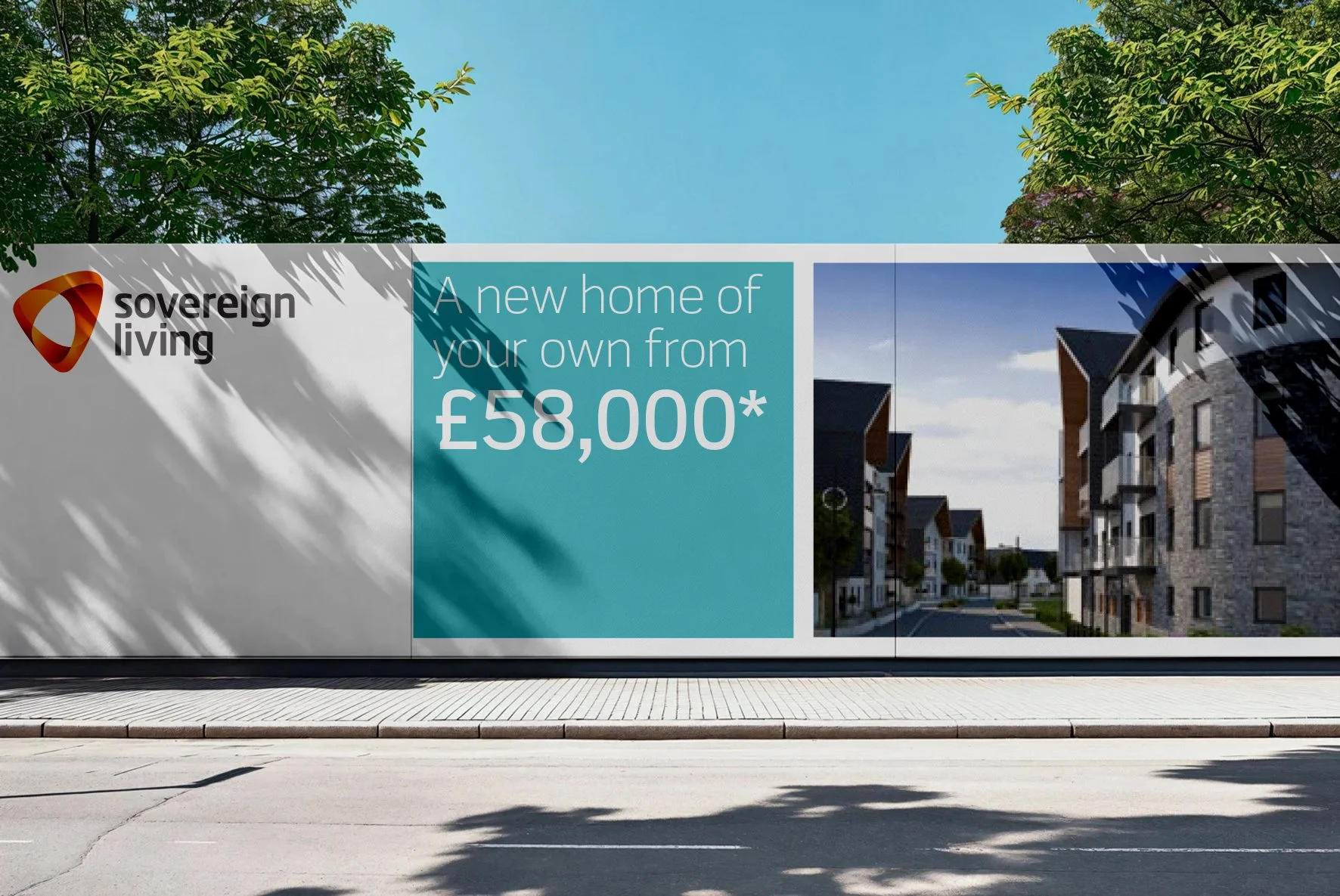
A rebrand for Sovereign, who provide social housing for over 70,000 residents, they also develop housing under the company Sovereign Living. Working with my Creative Director we developed a structured brand that is based on the ‘foundations’ of the housing and development industry.
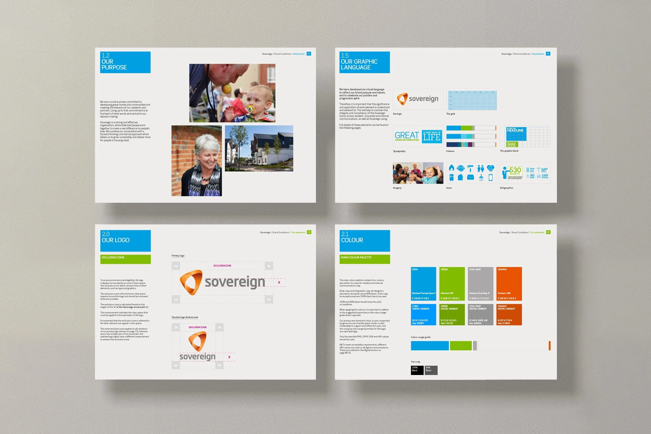
With the use of a strict grid system that represents the housing and architectural world, we created a fresh, consistent looking brand that appeals to all the residents. The brand has an editorial feel typographically and visually to represent the many stories of the residents.
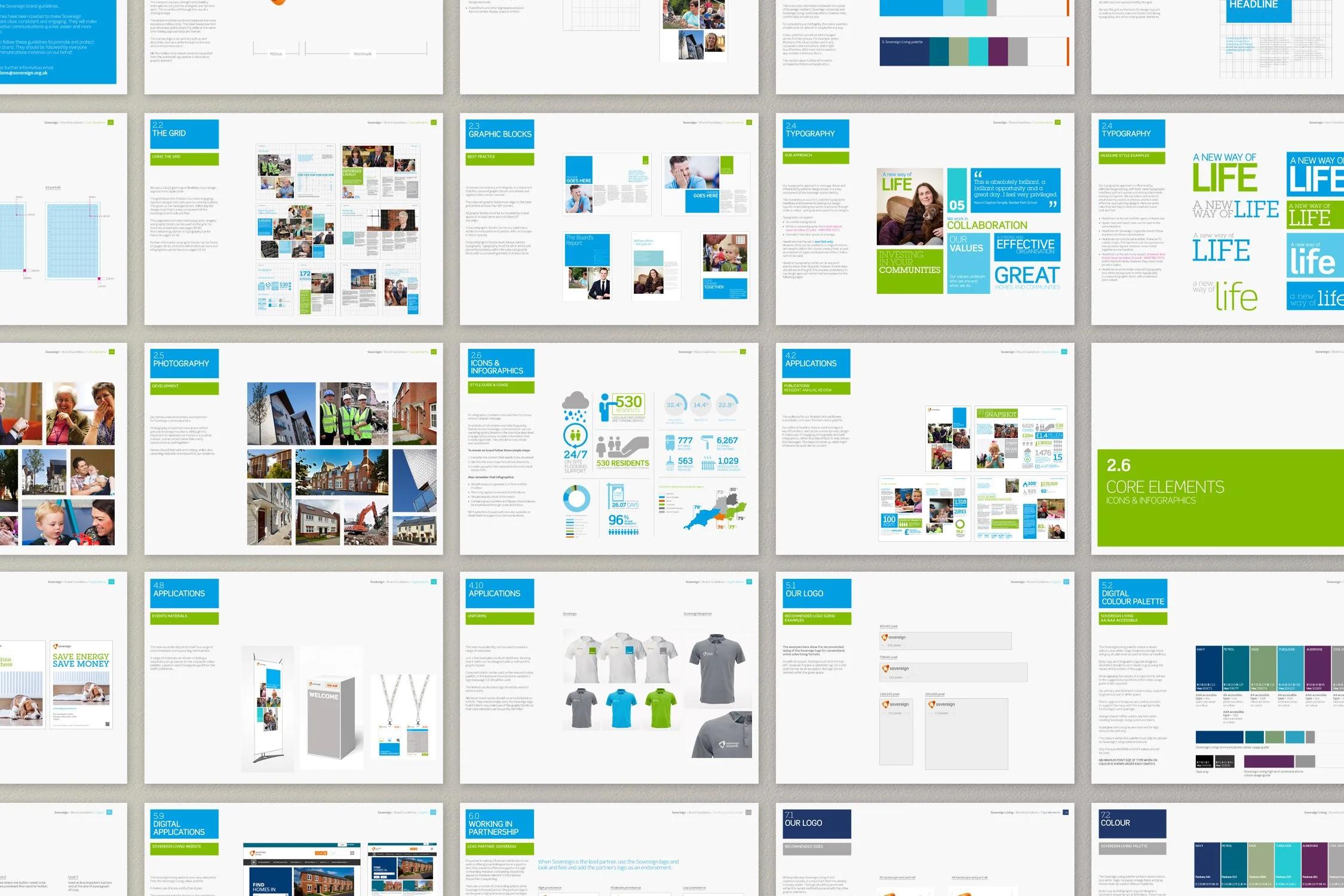
I designed the visual language, brand guidelines, annual report and many other comms.
The Visual Foundation
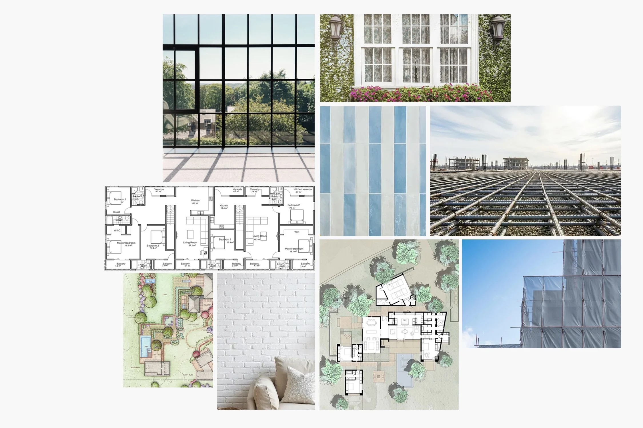
The grid takes inspiration from the architectural elements of the built environments which forms such a central part in our work.
It borrows visual cues from the fields of planning, architecture and construction. Development plots, technical drawings, architectural design, floor plans, scaffolding, brickwork and interior architectural elements such as door and window frames are all reflected and represented by the grid.
The grid is used as the basis for design layouts as well as to create the coloured blocks containing typography, one of our core graphic elements.